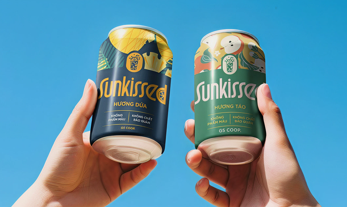
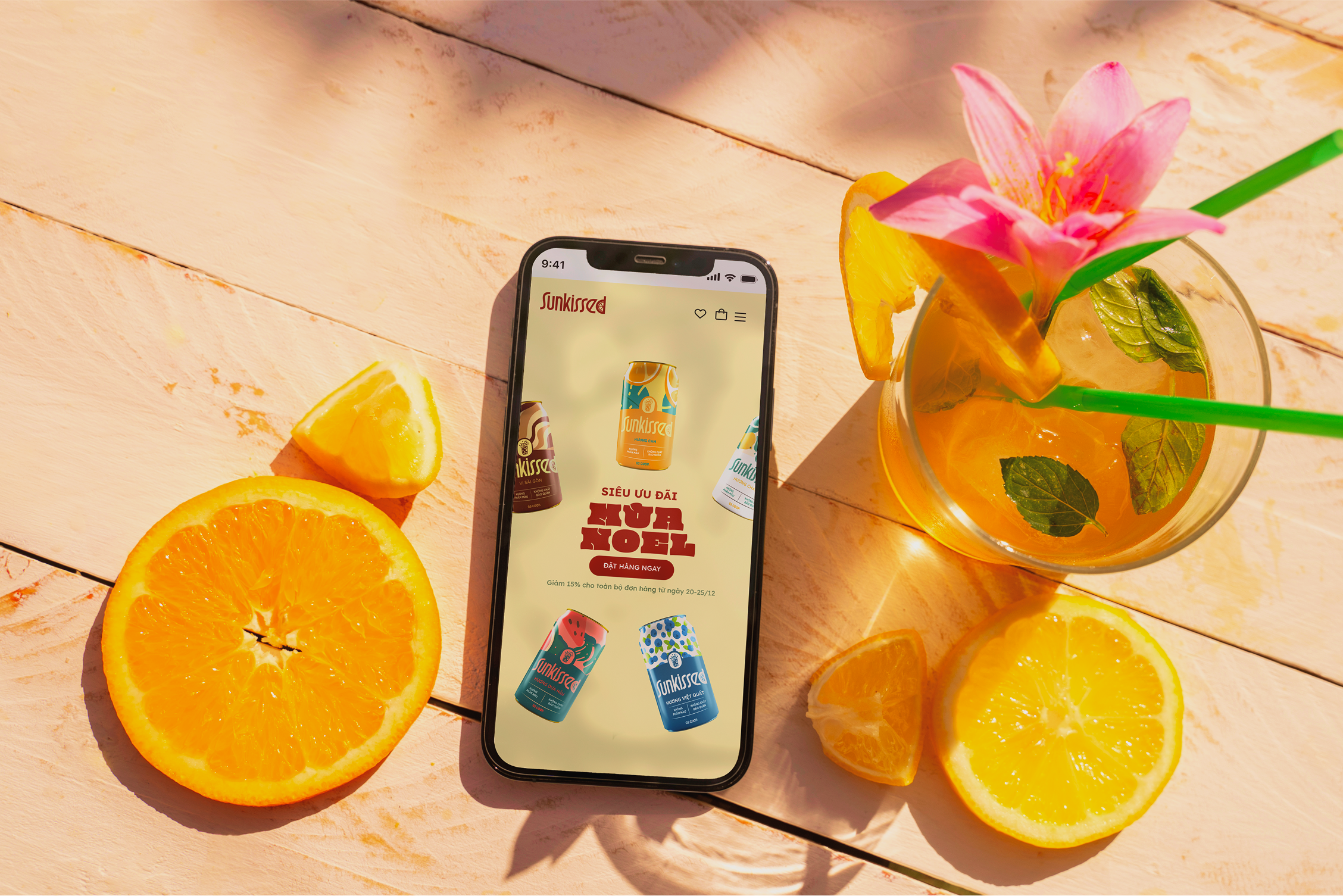
A vibrant and natural system that feels fresh, friendly, and handcrafted.
Sunkissed’s visual language draws inspiration from the natural ingredients and lively spirit of
homemade juice. Bright colors, soft curves, and playful illustrations work together to create a
look that is both approachable and energetic.
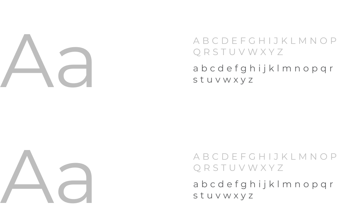
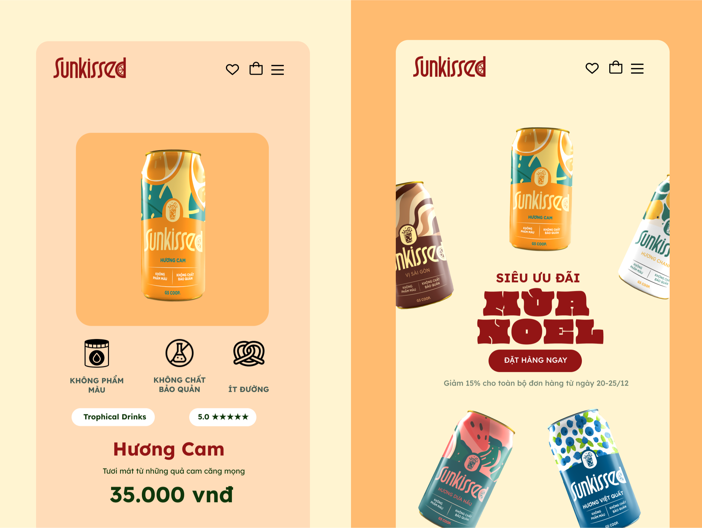
Sunkissed’s design system uses the Montserrat typeface for headings, delivering a bold, modern
presence, while Manrope serves as the body font for readability and simplicity across screens.
Both typefaces are set at light weight to convey a soft, natural feel.
The color palette reflects the brand’s essence—deep red for vitality and passion (primary), leaf
green for freshness (secondary), and a creamy neutral for warmth and balance. Together, they
create a clean, accessible experience that feels vibrant yet grounded.